About Me
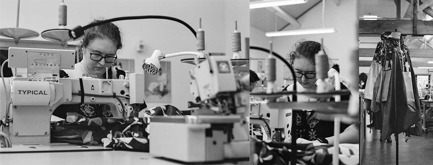
I'm Abbi, a fashion designer dedicated to equality and sustainability.
My final year journey started with a desire to positively impact fashion. By integrating my autism into my work, I strive to demonstrate that every autistic individual is unique and capable, challenging the misconception that disability means inability. I support sustainable practices and aim to design pieces that are both attractive and eco-friendly.
During my time at the University of Derby, I've accumulated valuable knowledge that I've been able to apply effectively to my final project. One notable instance was the collaboration with Helly Hansen, where I had the opportunity to repurpose one of their garments and contribute fresh ideas to the brand. For this project, I creatively experimented with details and functionality by upcycling an old tent belonging to my mother. My innovative efforts garnered recognition, resulting in a commendable 2nd place achievement.
INSPIRATION
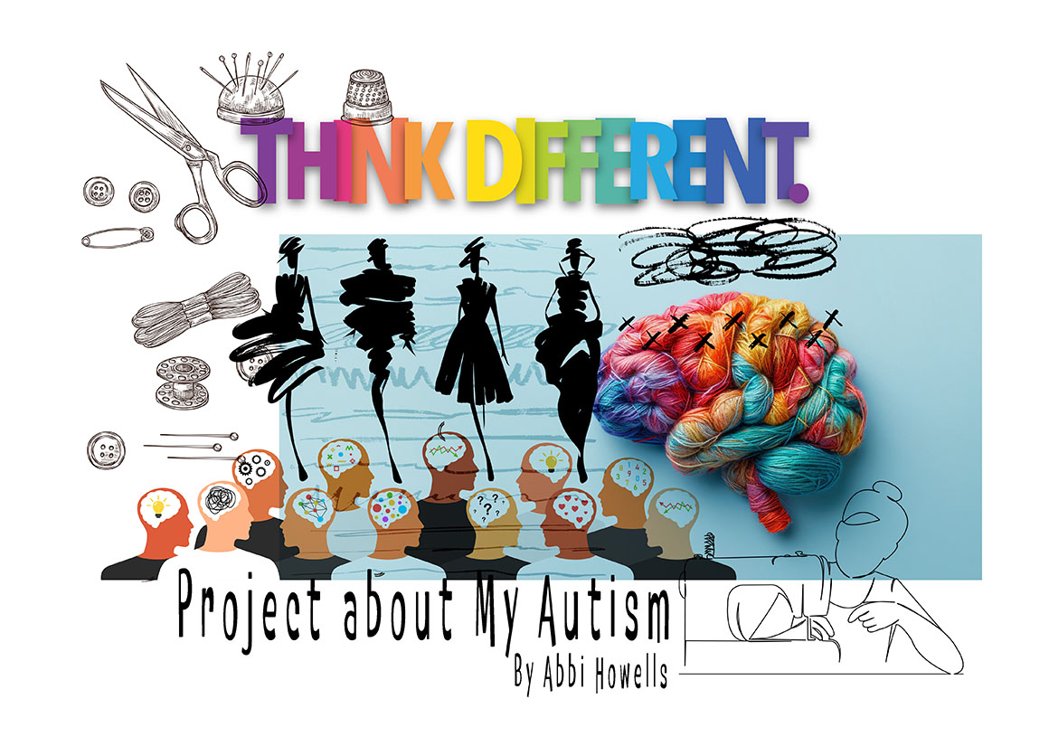
My work explores my autism, providing a unique way to explain it to others whilst raising awareness.
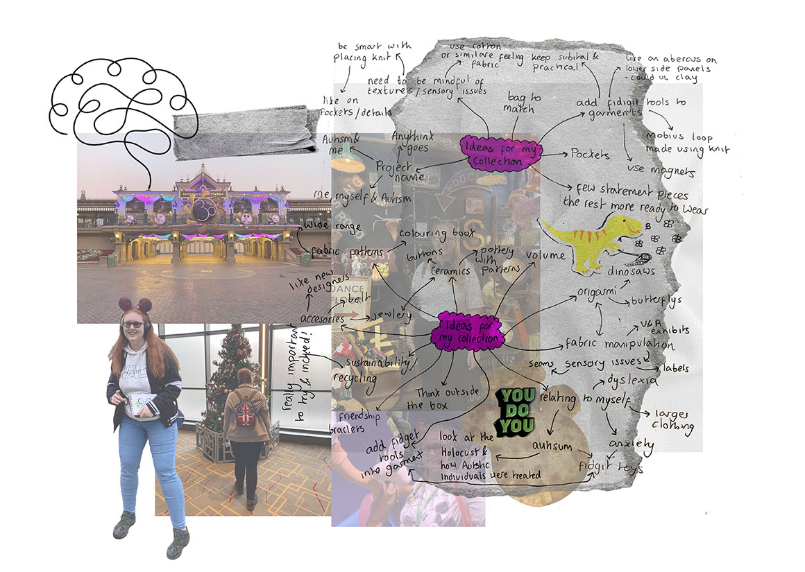
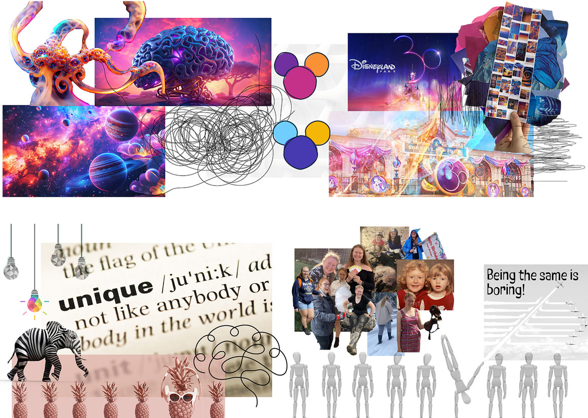
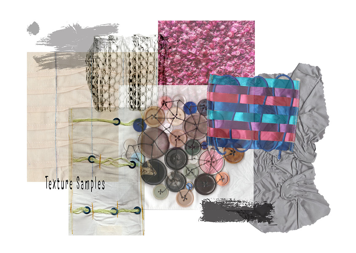
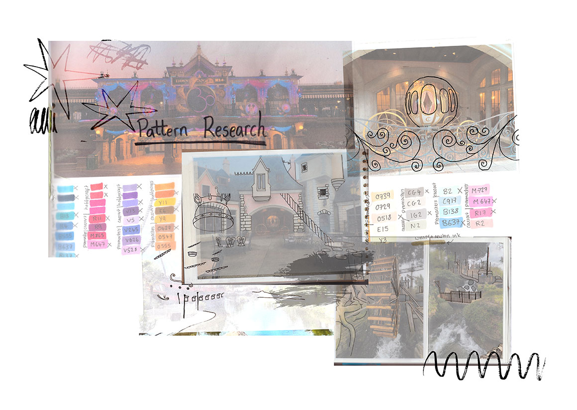
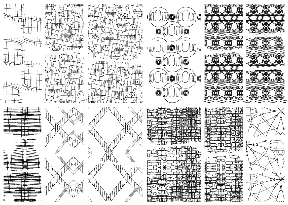
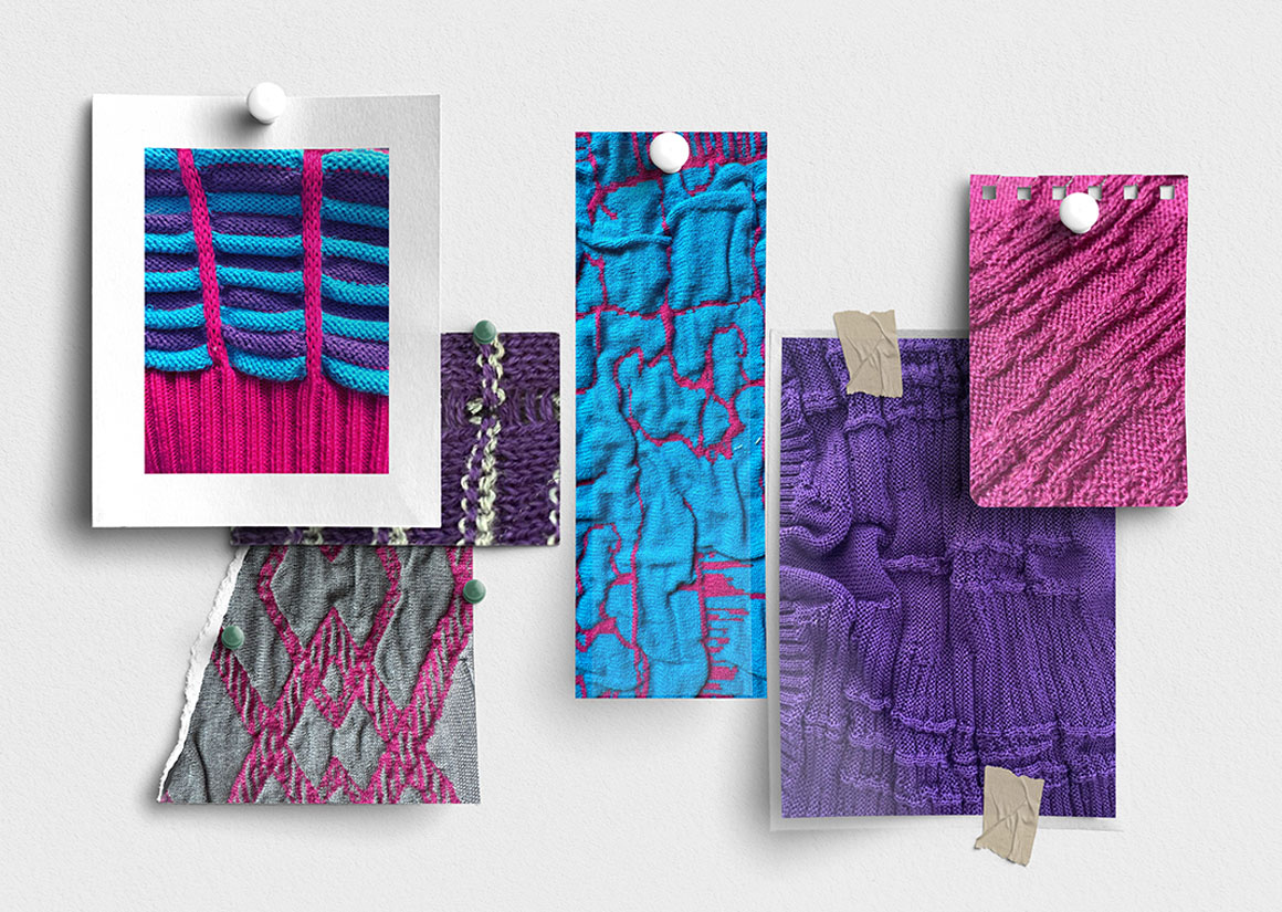
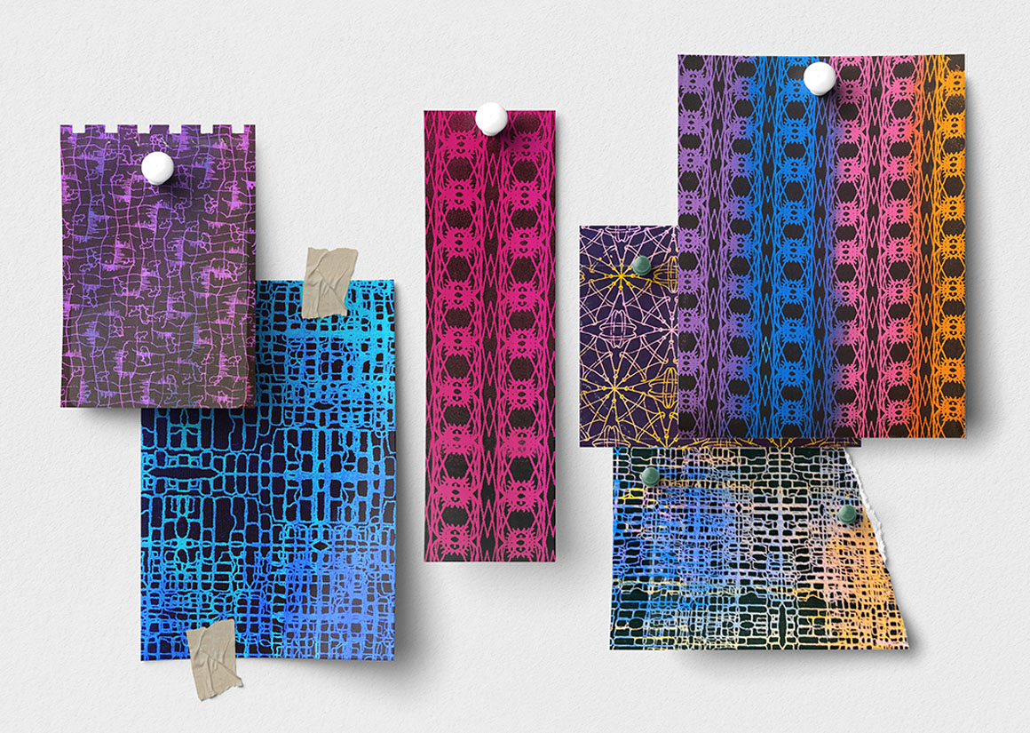
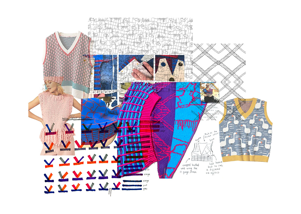
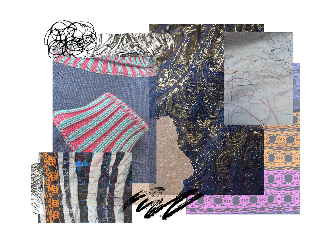
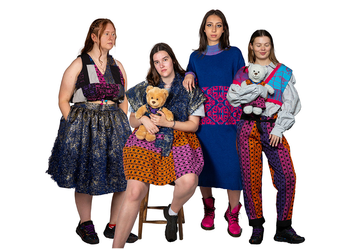
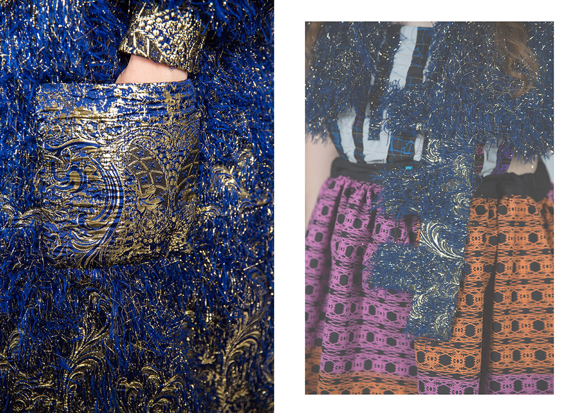
For my final year collection, I wanted to incorporate autism in a meaningful way. I decided to use my own experience with autism as a starting point, exploring how various factors affect me and what can be done to help. I chose heavily textured fabrics whilst also creating knits and prints to emphasize that everyone has different and unique support needs. My patterns were inspired by a visit to Disneyland Paris, where I was immersed in vibrant colours and intricate details, truly living the dream.
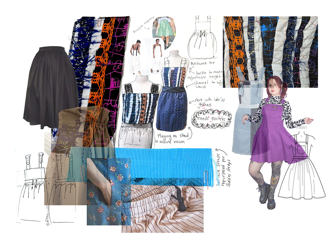
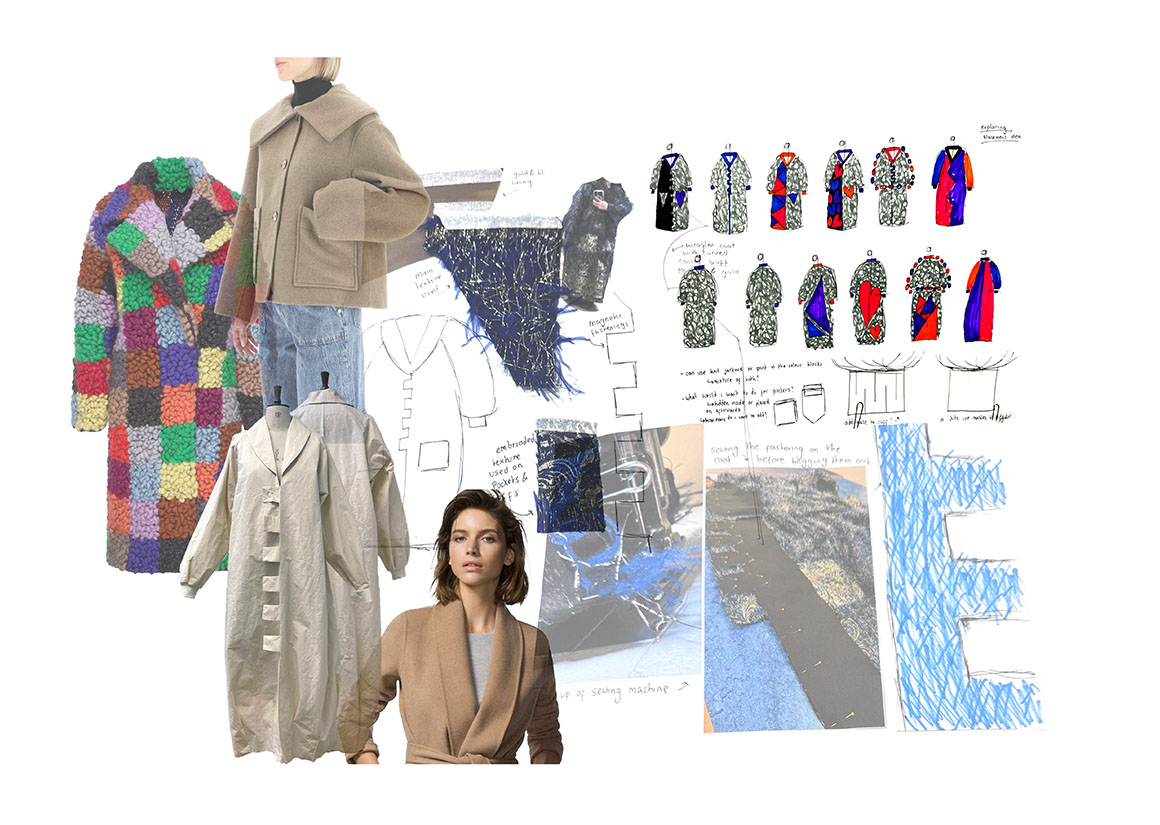
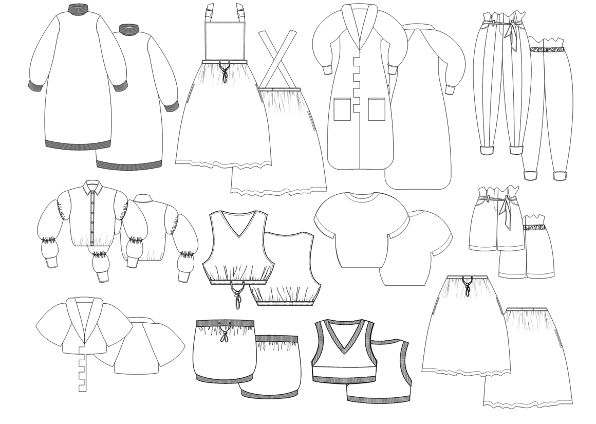
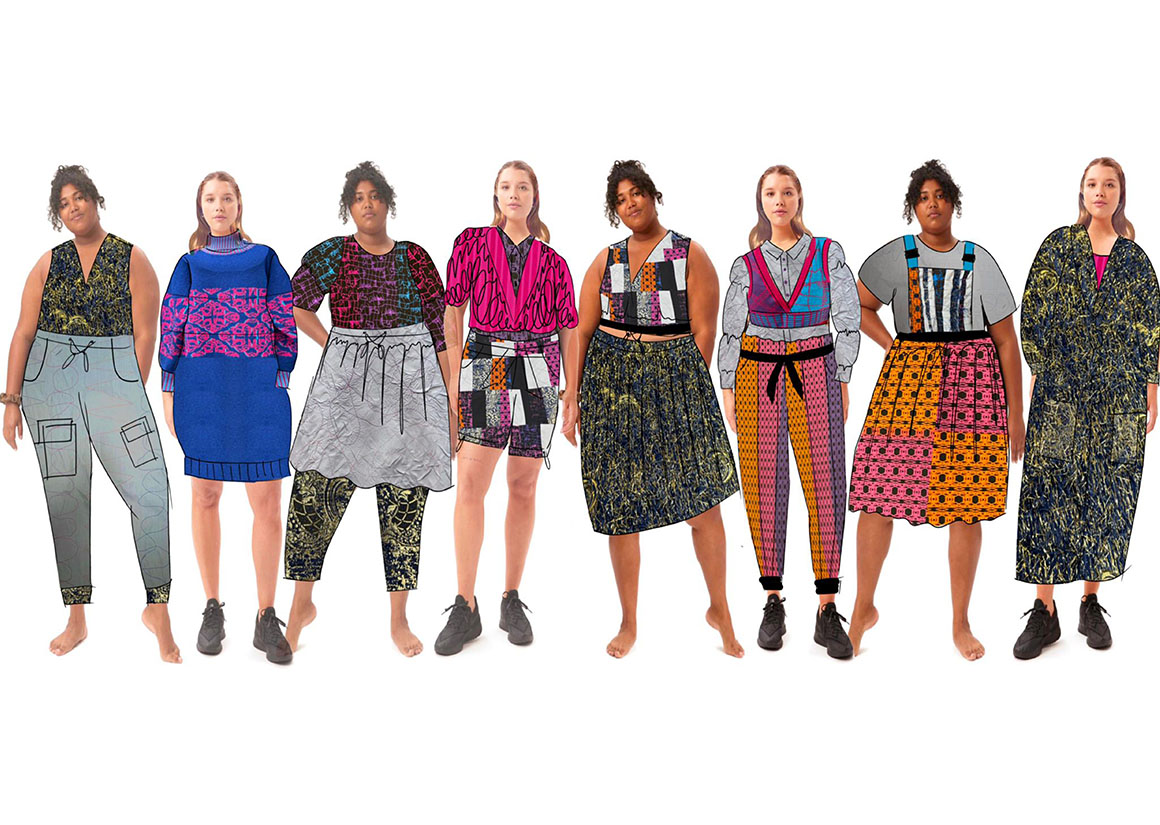
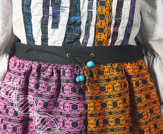
To ensure inclusivity across various body types, I incorporated sizing adjustments into my designs. This involved the strategic use of toggles, elastic, and meticulously crafted garments. Additionally, I maximized leftover fabric by fashioning it into new items, including outfits for my teddy bears, a reversible bag, a sensory pillow, and a top.
MY WORK
PORTFOLIOS
DETAIL
Bringing my print to life
I use screen printing to bring life to my prints, while incorporating a 3D element with puff binder. I chose this technique for its hands-on approach, which adds a personal touch to my fabrics and represents the individuality of every autistic person. After carefully examining different patterns and colour schemes, I decided to use black cotton as the base for my design. This choice provides a striking contrast to the vibrant colours in my palette. I selected bright and vivid shades of pink, orange, blue, and purple to create a dynamic and eye-catching effect. The bold background not only enhances these colours but also adds depth and richness to the overall aesthetic. This combination allows the intricate patterns to stand out, making each piece unique and visually appealing. My colour palette was inspired by a display in Disneyland Paris created for their 30th anniversary, which sparked joy every time I saw it.
