About Me
Hi, I'm Joely, a fashion design graduate from Leeds Arts University
Joely Seagrave is a fashion design graduate who creates for both menswear and womenswear. During her time completing her final major project, she discovered and grew a passion for print and surface pattern, and it has subsequently made a huge impact on her designing process and development.
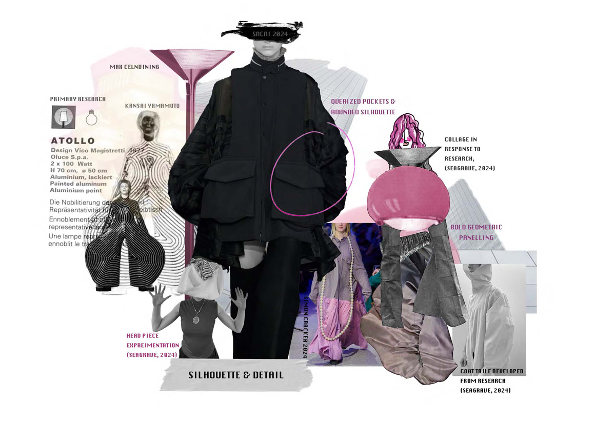
Alongside print, my design aesthetic is centred heavily around bold silhouettes and eccentric panelling, giving a geometric flair to my work. I shy away from subtlety, in hopes of provoking conversation and connection between my designs and it's observer/consumer, drawing most of my inspiration from nostalgia and well loved global topics such as music and sport.
INSPIRATION
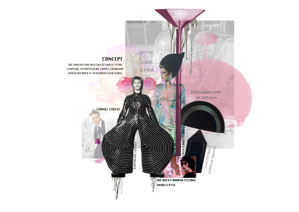
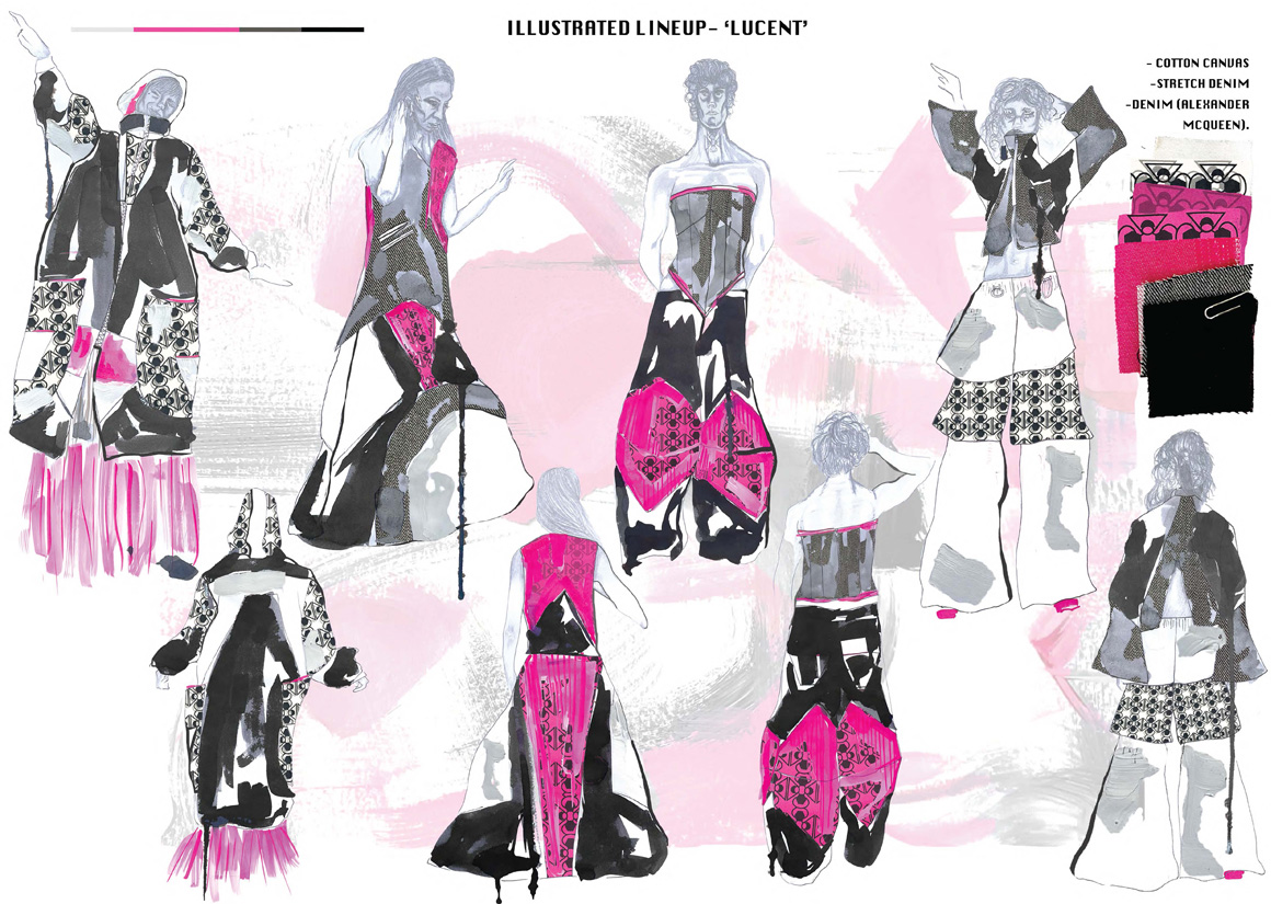
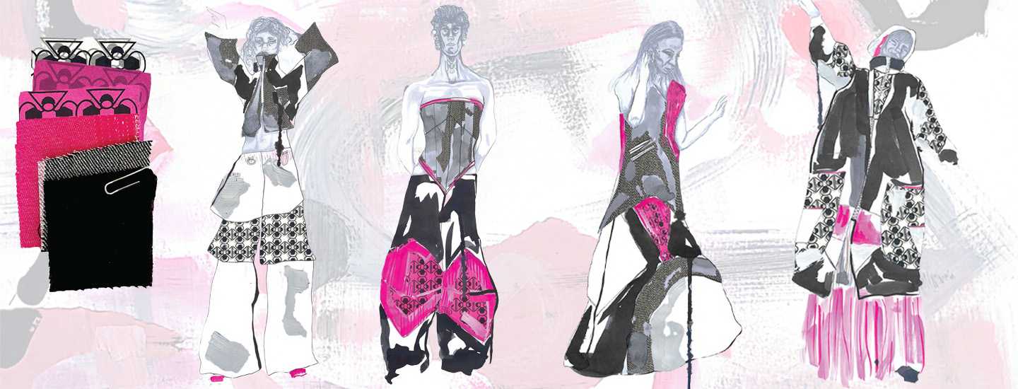
My inspiration has been drawn from fusing together 1970s interior design with glam rock.
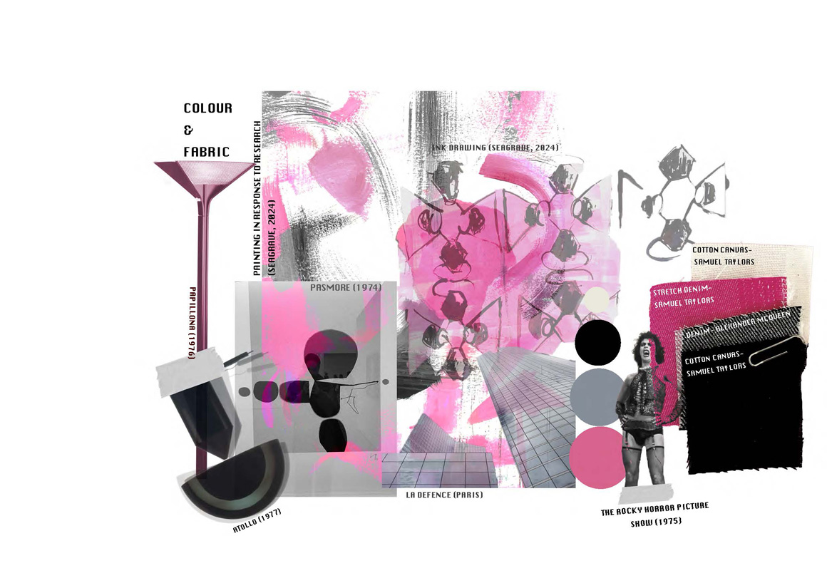
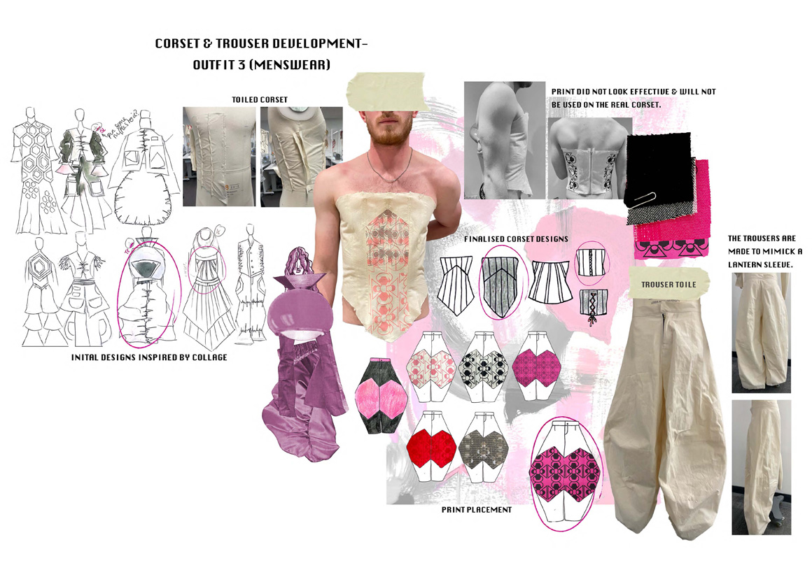
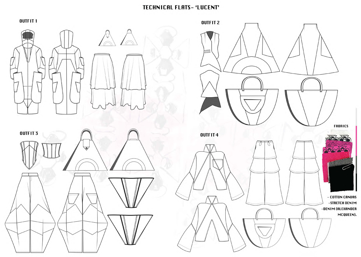
The concept behind this collection has come from 2 definitive elements, the first being 1970s interiors: more specifically lampshades, inspiring silhouette, details and geometric panelling. The second element being glam rock, and it's portrayal of femininity, which has been used as an influence for the colour schemes, fabrics, and print design. The idea behind this collection is create garments with enough impact so that they would be suitable to be worn during stage performances or creative music videos.
As the glam rock era has been such a large influence on this collection, it was very important for me to use icons such as Bowie, and Tim Curry in The Rocky Horror Picture Show to influence my design process. The 70s, especially in this particular music era is when the gender stereotypes began to be blurred more publicly by celebrities and their audiences; therefore it was imperative that I incorporate this more inclusive form of fashion to be such a major part of my work and my ethos as a designer.
MY WORK
PORTFOLIOS
DETAIL
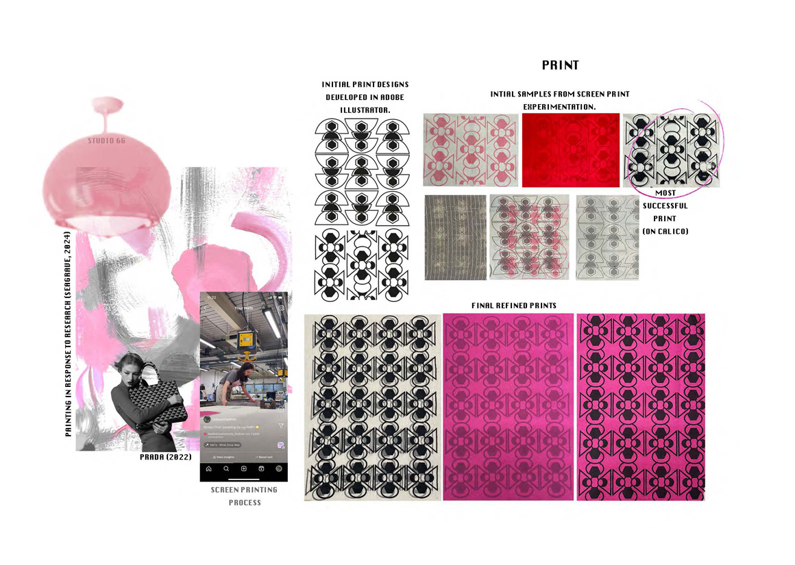
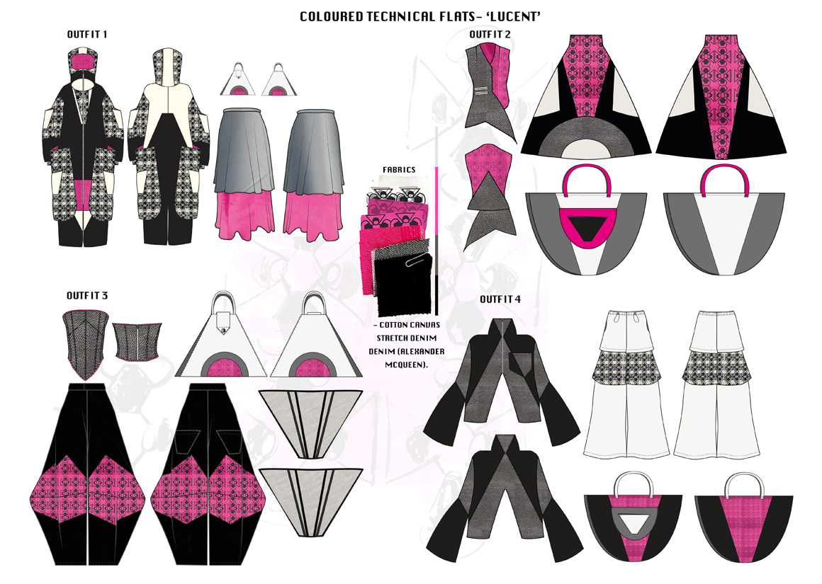
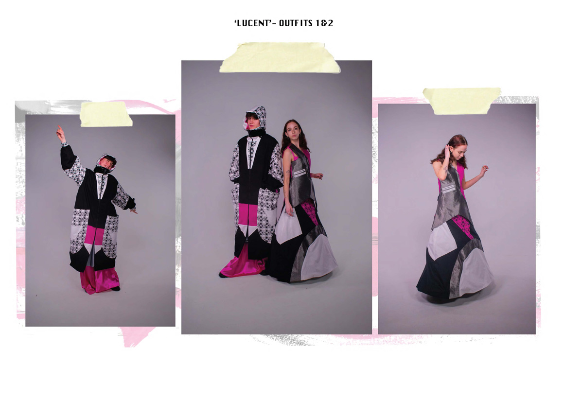
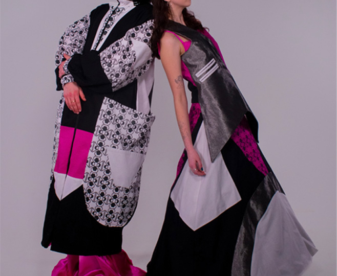
I have created a geometric print design to be incorporated into each outfit of the collection.
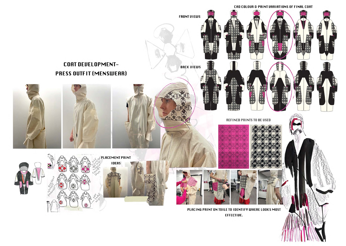
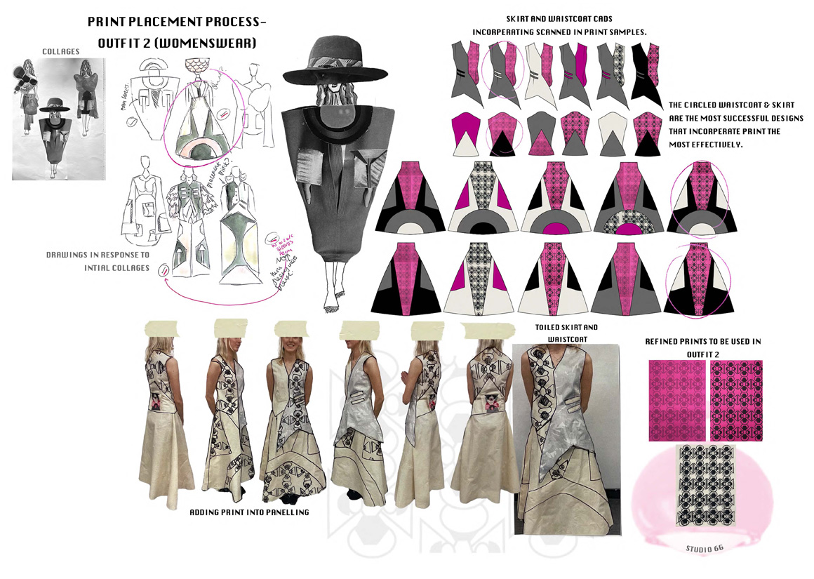
This print design, inspired by glam rock and 70s interior, was created digitally but placed on fabrics using the screen printing method. The print has appeared on a variation of cotton canvases and denims, and each fabric has been paired specifically to an ink colour of plain black, grey or a layered mixture of the 2. This surface pattern is a repeat print design, featured the most heavily in my press outfit (on the left), in large, exaggerated panels and pockets in order to bring an emphasise of boldness and fluidity to the garment, and overall collection. In other outfits such as the skirt (on the right) the print has been subdued by using grey ink on pink denim. This was done in order to not overpower the whole outfit as more of a mixture of fabrics and textures have been used. Having several versions of the print shows the versatility of the design, and gives credit to it's inspiration as it creates a larger and more inclusive target demographic which is what this collection represents.
