About Me
Design by Maisie Bullock, a Leeds Arts University graduate.
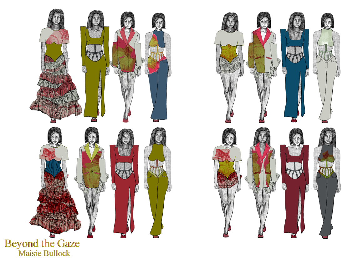
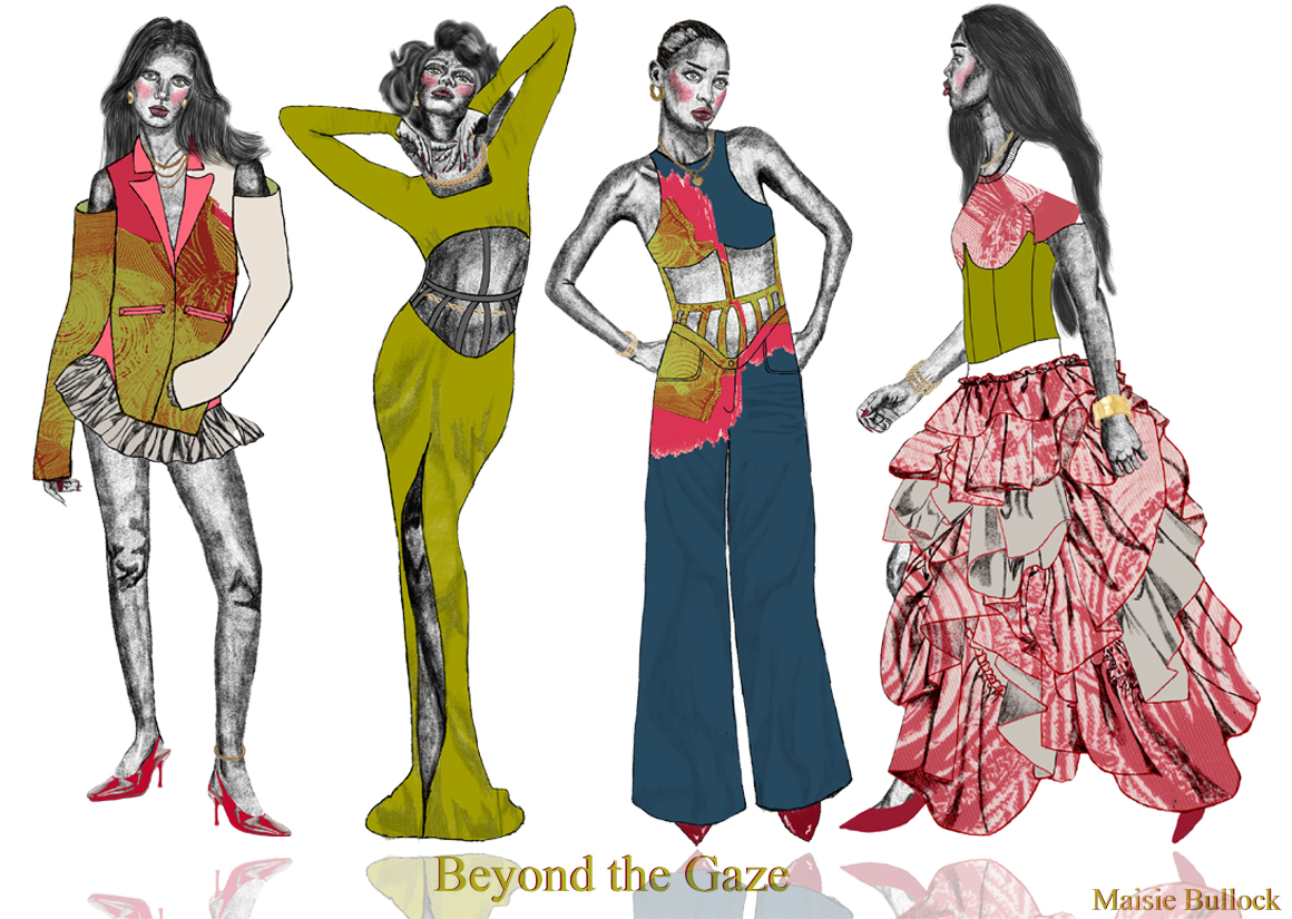
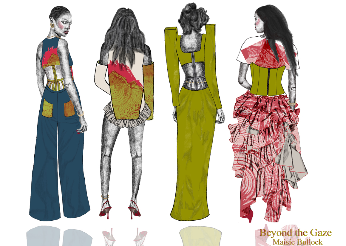
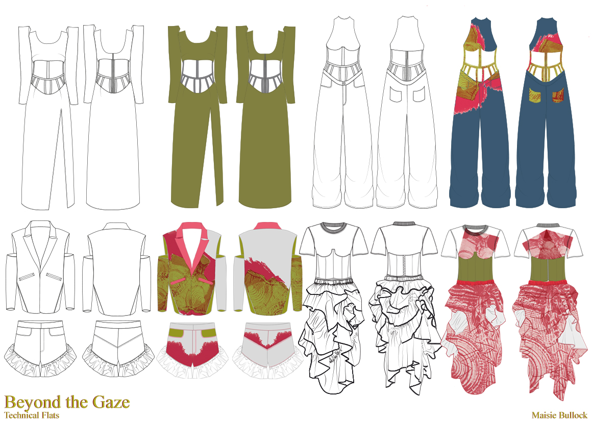
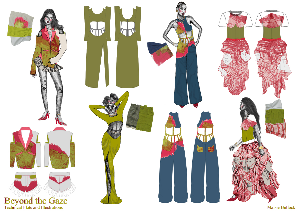
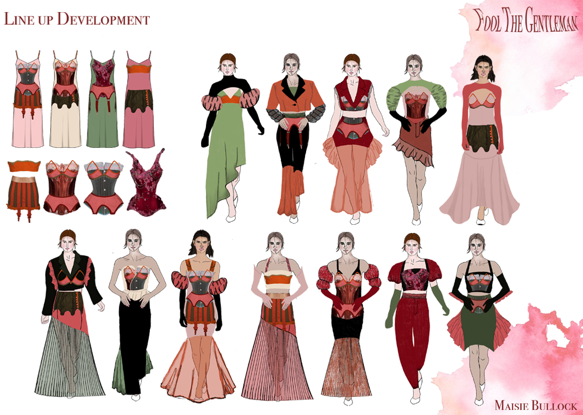
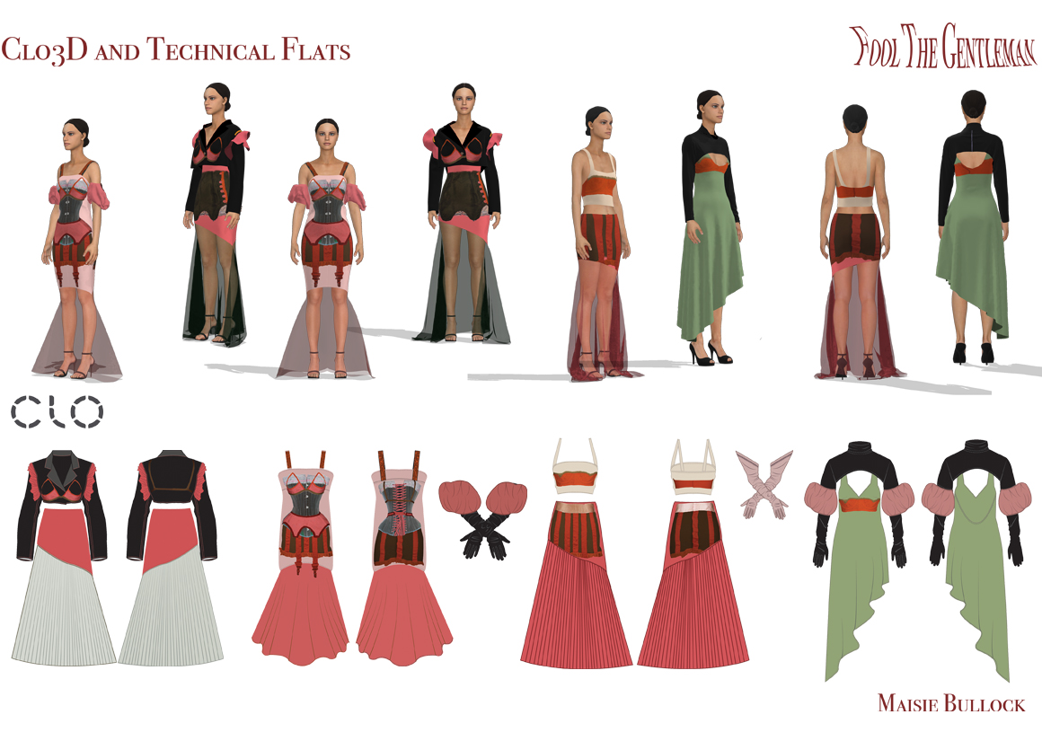
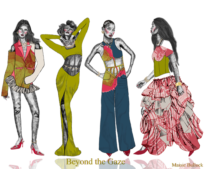
Maisie Bullock's Graduate collection 'Beyond the Gaze' is representative of Female Empowerment with ignorance to the 'Male Gaze' and its influence on feminine fashion and design. The collection highlights Bullock's love for technical design, including Illustrator and Clo3D; as well as colour and print to add a contemporary and lively atmosphere to her work.
'Beyond the Gaze' is a collection that recognises the importance of female designers and the influence they have within the industry. The intention was to focus on the female gaze, and how the designs are interpreted by women as oppose to the prioritisation of the male gaze which we see so commonly considered within the fashion industry. Designing for the female gaze allowed for alluring, powerful designs that liberate women, without objectifying them and with no concern to a derogatory or misogynistic perception.
INSPIRATION
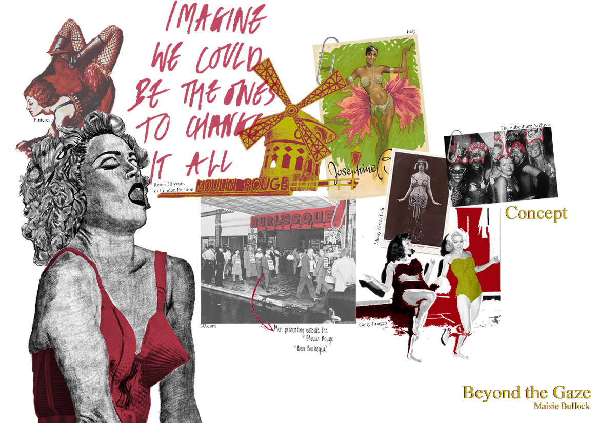
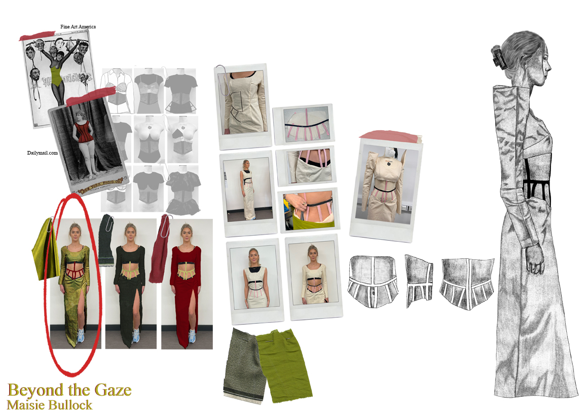
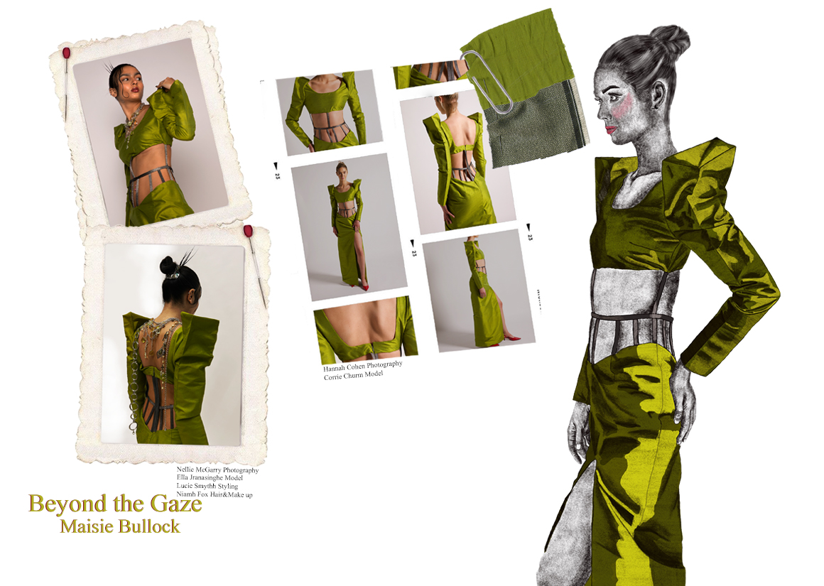
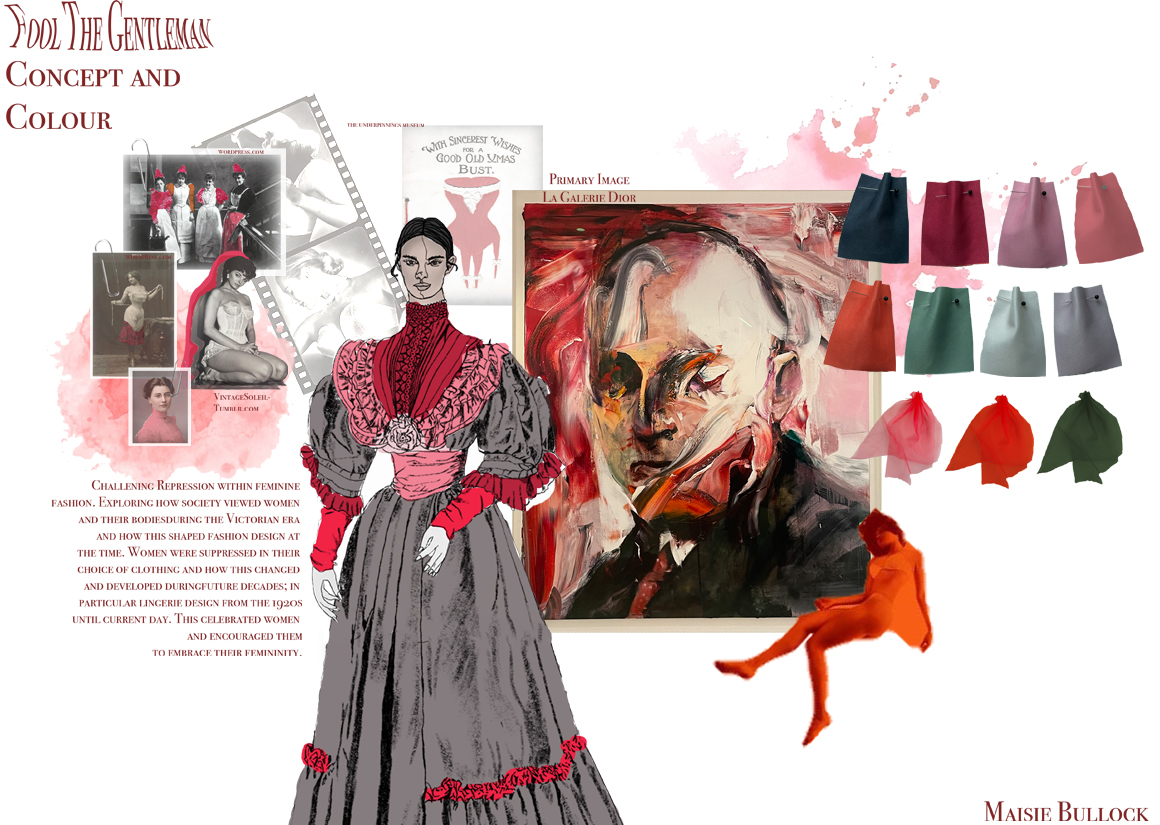
Combining showgirl costumes such as Burlesque with Lingerie Design in a glamorous, alluring way.
The initial inspiration for 'Beyond the Gaze', was the over sexualisation of women, both contemporarily and historically and how sexism has shaped the lives of women since the seventeenth century. The visual atmosphere for this collection was inspired by Showgirl costumes; such as Burlesque, and lingerie design from across the twentieth century. The intention- designing a collection with complete ignorance to objectification and eroticisation and a complete focus of the feminine gaze.
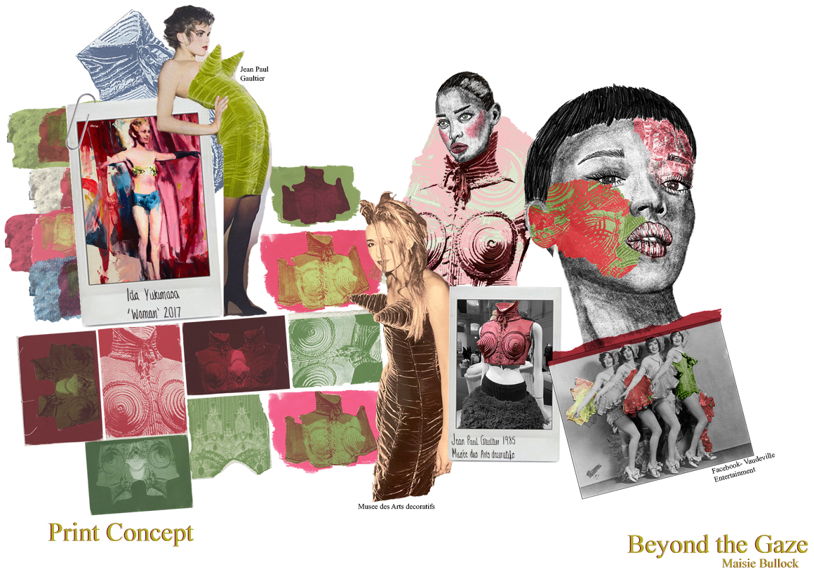
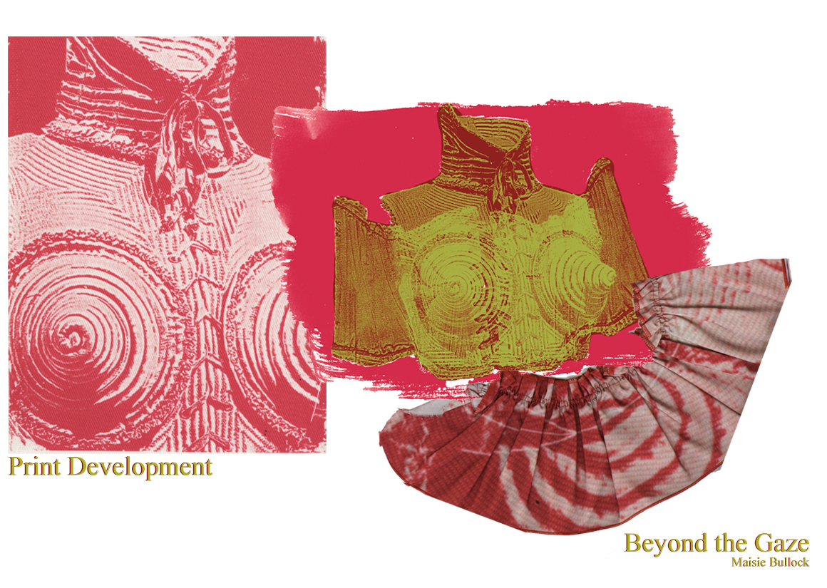
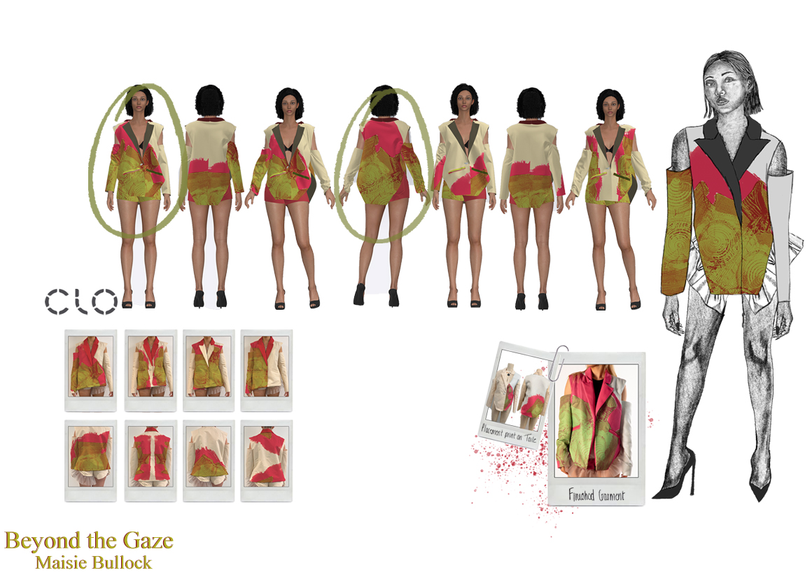
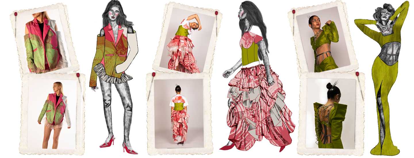
Print became a fundamental element of 'Beyond the Gaze', and really helped add a contemporary, lively atmosphere to the collection. Lingerie design was a huge inspiration for the initial print design, as well as primary images of Jean Paul Gaultier corsets. These images were used within Cyanotype printing and then further developed digitally to create unique prints, that embodied the initial colour and concept inspiration for the collection.
MY WORK
PORTFOLIOS
DETAIL
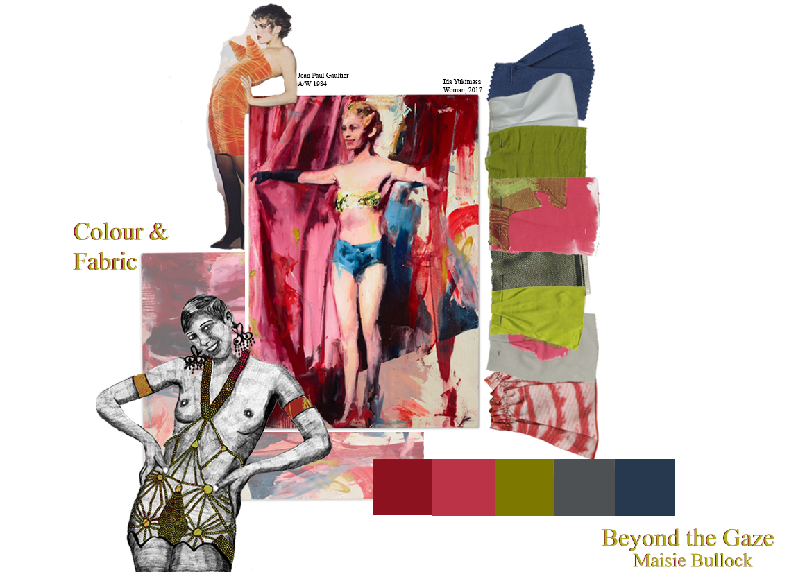
'Developing the colour scheme, became an integral step in portraying a fierce feminine confidence'
Jean Paul Gaultier's corsets became the forefront influence for print. Through Cyanotype printing, these primary images were developed into a unique print that embodies the initial concept and inspiration of the collection. Alongside this, developing the colour scheme became an integral step in portraying a fierce feminine confidence. Contrasting soft girlish colours like Pink, with a luminous Chartreuse allowed the collection to really represent the strength and confidence intended. Chartreuse is a bold and unconventional colour, often associated with liveliness and a carefree attitude. The purpose of using this shade as the feature colour for the collection, was to embody these qualities and add a dynamic and eye-catching element. Within colour psychology, Green is often assosciated with balance and harmony, supporting the Feminist ideology that first inspired this collection. The Red/Pink shades within the palette were chosen to juxtapose the ideas of femininity and romance with confidence and passion.
